volkadot. Educational design
volkadot. Освітній дизайн
brand identity
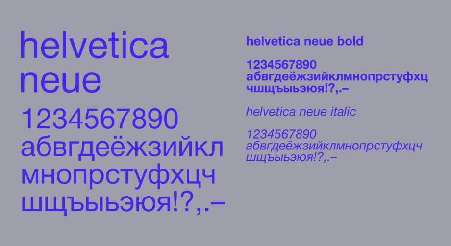
Логомарк volkadot — це напис, виконаний кастомізованим шрифтом Roobert Pro. Шрифт належить до категорії лінеальних гуманістичних гротесків. Характер напису — діловий, дружній, простий і водночас людяний. Слово набрано малими літерами, що надає тону демократичності.
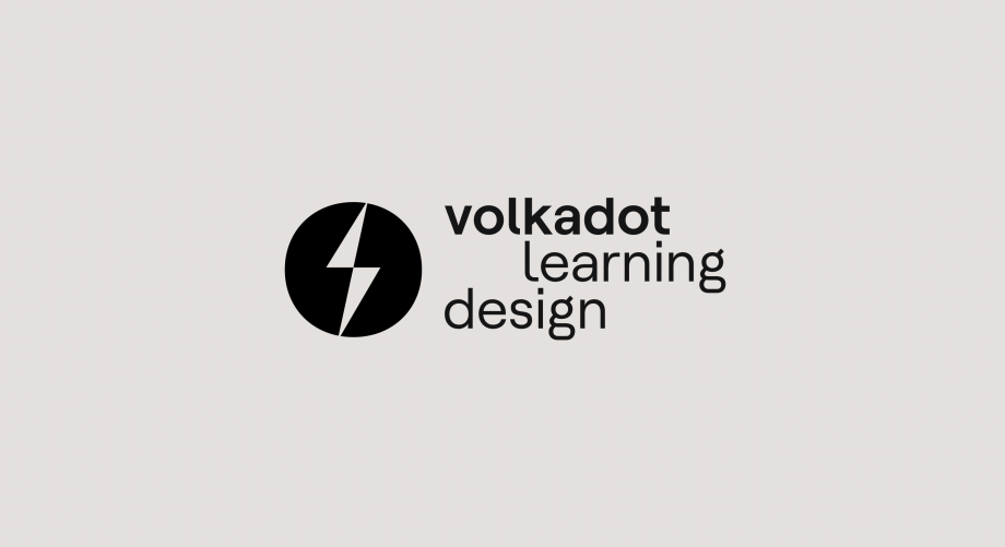
Знак volkadot являє собою блискавку, вписану в супереліпс — фігуру, подібну до кола, але з більш складною геометрією. Блискавка, на відміну від класичної піктограми, виконана у спрощеній, геометризованій манері. Вона ділить еліпс на дві половини, відображаючи взаємодоповнювальний характер робочого дуету співзасновниць стартапу. Блискавка є метафорою потенціалу, що вивільняється у процесі співпраці з сервісом volkadot. Водночас вона символізує живий, «з іскрою», характер комунікації у процесі роботи.
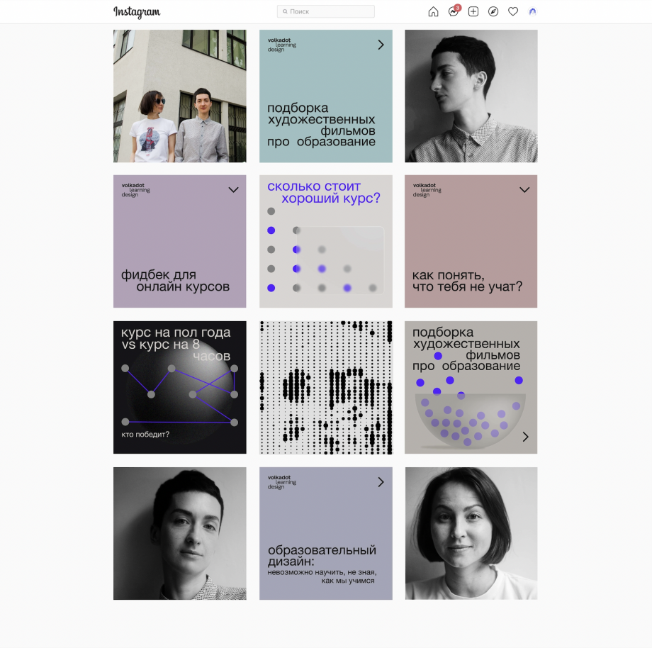
Одним із елементів айдентики є абстрактні ілюстрації, що супроводжують типографіку. Мовою метафори вони відображають те, що сформульовано словами. Своєю чергою, патерн volkadot — це матриця, у якій точка виступає головним модулем. Залежно від градації точки змінюється і візуальний код патерна: від зображального до абстрактного.
The volkadot logomark is an inscription made with a customized Roobert Pro font. The font belongs to the category of linear humanistic grotesques. The nature of the inscription is businesslike, friendly, uncomplicated, humane. The word is typed in lowercase letters, which gives a democratic tone.
The volkadot sign is a lightning bolt inscribed in a superellipse, a circle-like figure with slightly more complex geometry. Lightning, unlike the Western pictogram, works in a simpler, geometrized way. It divides the ellipse into two halves, reflecting the complementary nature of the working duo of startup collaborators. Lightning is a metaphor for the parties released in the process of cooperation with the volkadot service. It is also of high quality, "with fire", communication in the proccess of the work.
One of the elements of the identity are abstract illustrations that accompany the typography. In the language of metaphor, they reflected what is written in words. In turn, the volkadot pattern is a matrix where the point of the main module is. Depending on the gradation of the point, the visual code of the pattern also changes: from an image to an abstract one.


other works / другие работы
-
 Im Zeitraffer. Kunsthaus Graz
У часовому проміжку. Кунстхаус Грац spatial, mural, poster, infographics -
 XX Kunsthaus Graz
XX Кунстхаус Грац visual identity, poster -
 Minus minus plus plus
- - / + + visual identity, digital campaign, poster -
 Blueprint for a Museum. Kunsthaus Graz
План музею, Кунстхаус Грац book design, layout -
 JOHN'S HOTEL
JOHN'S HOTEL brand identity -
 ELECTRON CAFE
ELECTRON. Кафе brand identity -
 KAI FENG. Direct tea trade merchants
KAI FENG. Чайна компанія brand identity -
 FUNATTIC. Climbing center
FUNATTIC. Скелелазний центр brand identity -
 SNIG NA GOLOVU. Restaurant
СНІГ НА ГОЛОВУ. Ресторан brand identity -
 FAHRWEST LOGISTICS
FAHRWEST. Логістична компанія brand identity -
 EASTMAN. Restaurant
ІСТМЕН. Ресторан brand identity -
 lardi. Cargo transportation
lardi. Вантажні перевезення brand identity -
 BECAMP. Coworking space
BECAMP. Коворкінг нового покоління brand identity -
 GOGOL
GOGOL
GOGOL brand identity -
 Meddins
Meddins -
 Nasha Dacha
Наша Дача -
 THEURA. SOFIA YABLONSKA
ТЕУРА. СОФІЯ ЯБЛОНСЬКА -
 TURTLE. Antisocial network
Антисоціальна мережа TURTLE brand identity -
 PRIDE BIKES
Український велобренд brand identity -
 LOCUS DESIGN GROUP
Группа компаний Локус Дизайн brand identity -
 Sandhaana Yoga
Сандхаана Йога brand identity -
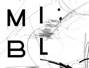 MISHI BLYAHERA. Restaurant
Мыши Бляхера. Ресторан brand identity -
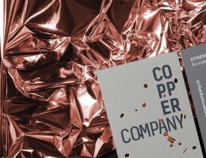 Copper Company. Architecture bureau
Архитектурное бюро. Copper Company -
 Italian Edition & Italian Edition №2
Итальянская Редакция & Итальянская Редакция №2 -
 Grata Eco House Suisse
Швейцарский офис Грата Еко Хаус identity, visual identity, logo, catalogue design -
 ZUZU. Restaurant
ЗУЗУ. Ресторан brand identity -
 Car Castle. Swiss luxury car storage
Car Castle. Гаражный комплекс класса люкс brand identity -
 ZhZL
ZhZL
ЖЗЛ brand identity -
 +object. Design and production
Дизайн и продакшен компания +object brand identity, naming -
 Kazimir Malevich. Kyiv period. 1928-1930
Казимир Малевич. Київський період 1928-1930 book design -
 Café Très
Café Très brand identity, naming -
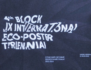
-tmb.jpg) International Eco-poster Triennial “the 4th Block”
International Eco-poster Triennial “the 4th Block”
IX Міжнародна Триєнале Еко-плакату "4-й Блок" visual identity -
-tmb.jpg) Lit Museum identity
Lit Museum identity
Ідентифікація Літ Музею brand identity -
 Linia art / UA avant-garde
Лінія art / український авангард promo -
 Linia art / UA kilim design
Лінія art / українські килими promo -
 Ukrainian prints
Українські принти promo -
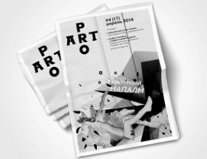 ProArt
ProArt editorail design -
 Catalog of IX International Eco-poster Triennial "the 4th Block"
Каталог ІХ Міжнародної Триєнале Еко-плакату «4-й Блок» book design -
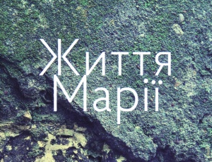 Life of Mariya
Життя Марії book design -
 Staging the Ukrainian Avant-garde of the 1910s and 1920s
Інсценізація українського авангарду 1910-1920 років book design -
 Dia/Log*
Дія/Лог poster -
 Poster FAQ
Poster FAQ poster -
-tmb.jpg) "Utopia 8" Intelligent Store
"Utopia 8" Intelligent Store
Інтелектуальна Крамниця «Утопія 8» corporate branding -
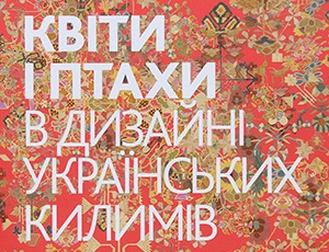 Flowers and Birds in Ukrainian Kilim Design
Квіти і птахи в дизані українських килимів book design -
 GRAFPROM's bags
Сумки от GRAFPROM bags and stuff -
 Luk
Luk
Lюk cd cover -
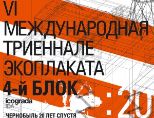 VI International Eco-Poster Triennial "the 4th Block"
VI Международная Триеннале Эко-плаката «4-й Блок» exhibition identity -
 VII International Eco-Poster Triennial "the 4th Block"
VII Международная Триеннале Эко-плаката «4-й Блок» exhibition identity -
 Boris Kosarev
Борис Косарев book design -
 Cossac Mamai
Козак Мамай book design -
 Presentation of Mamai book
Презентаці книги «Козак Мамай» promo