
Grata Eco House Suisse
Швейцарский офис Грата Еко Хаус
identity, visual identity, logo, catalogue design
При создании айдентики Grata Eco House Suisse мы вдохновлялись образом дома простых и строгих геометрических форм стоящего на холме в диком и прекрасном природном пейзаже. Ключевые ассоциации айдентики GRATA ECO HOUSE – надежность, технологичность, натуральность и экологичность. Все они отражены в логотипе компании.
Шрифт построен на основе классических пропорций в модернисткой традиции. основательный, надежный, устойчивый. в самом слове GRATA уже закодированы экологичность и форма дома. Буква G, стилизованная под знак ресайклинг-стрелки, символизирует экологичный подход в работе компании. Графема букв А устойчива и надежна, как хороший дом.
Знак содержит в себе букву G и изометрическое изображением дома. Образ несет в себе крепкую ясность и внутреннюю динамику
When creating the identity of Grata Eco House Suisse, we were inspired by the image of a house of simple and strict geometric forms standing on a hill in a wild and beautiful natural landscape. Key associations of the identity GRATA ECO HOUSE - reliability, manufacturability, naturalness and environmental friendliness. All of them are reflected in the company logo.
The font is built on the basis of classical proportions in the modernist tradition. solid, reliable, stable. In the word GRATA the ecological compatibility and the form of the house are already coded. The letter G, stylized as a sign of recycling arrows, symbolizes an eco-friendly approach to the work of the company. The letter aram is stable and reliable, like a good house.
The sign contains the letter G and an isometric image of the house. The image carries a strong clarity and internal dynamics


other works / другие работы
-
 Im Zeitraffer. Kunsthaus Graz
У часовому проміжку. Кунстхаус Грац spatial, mural, poster, infographics -
 XX Kunsthaus Graz
XX Кунстхаус Грац visual identity, poster -
 Minus minus plus plus
- - / + + visual identity, digital campaign, poster -
 Blueprint for a Museum. Kunsthaus Graz
План музею, Кунстхаус Грац book design, layout -
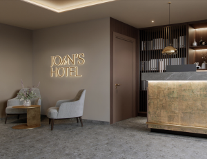 JOHN'S HOTEL
JOHN'S HOTEL brand identity -
 volkadot. Educational design
volkadot. Освітній дизайн brand identity -
 ELECTRON CAFE
ELECTRON. Кафе brand identity -
 KAI FENG. Direct tea trade merchants
KAI FENG. Чайна компанія brand identity -
 FUNATTIC. Climbing center
FUNATTIC. Скелелазний центр brand identity -
 SNIG NA GOLOVU. Restaurant
СНІГ НА ГОЛОВУ. Ресторан brand identity -
 FAHRWEST LOGISTICS
FAHRWEST. Логістична компанія brand identity -
 EASTMAN. Restaurant
ІСТМЕН. Ресторан brand identity -
 lardi. Cargo transportation
lardi. Вантажні перевезення brand identity -
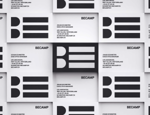 BECAMP. Coworking space
BECAMP. Коворкінг нового покоління brand identity -
 GOGOL
GOGOL
GOGOL brand identity -
 Meddins
Meddins -
 Nasha Dacha
Наша Дача -
 THEURA. SOFIA YABLONSKA
ТЕУРА. СОФІЯ ЯБЛОНСЬКА -
 TURTLE. Antisocial network
Антисоціальна мережа TURTLE brand identity -
 PRIDE BIKES
Український велобренд brand identity -
 LOCUS DESIGN GROUP
Группа компаний Локус Дизайн brand identity -
 Sandhaana Yoga
Сандхаана Йога brand identity -
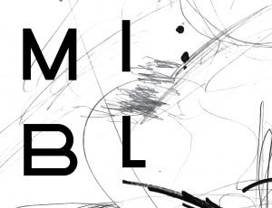 MISHI BLYAHERA. Restaurant
Мыши Бляхера. Ресторан brand identity -
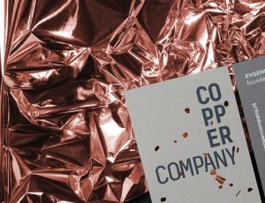 Copper Company. Architecture bureau
Архитектурное бюро. Copper Company -
 Italian Edition & Italian Edition №2
Итальянская Редакция & Итальянская Редакция №2 -
 ZUZU. Restaurant
ЗУЗУ. Ресторан brand identity -
 Car Castle. Swiss luxury car storage
Car Castle. Гаражный комплекс класса люкс brand identity -
 ZhZL
ZhZL
ЖЗЛ brand identity -
 +object. Design and production
Дизайн и продакшен компания +object brand identity, naming -
 Kazimir Malevich. Kyiv period. 1928-1930
Казимир Малевич. Київський період 1928-1930 book design -
 Café Très
Café Très brand identity, naming -
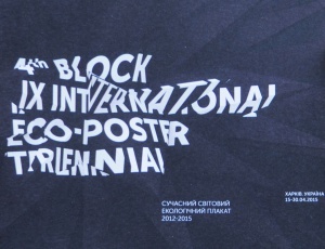
-tmb.jpg) International Eco-poster Triennial “the 4th Block”
International Eco-poster Triennial “the 4th Block”
IX Міжнародна Триєнале Еко-плакату "4-й Блок" visual identity -
-tmb.jpg) Lit Museum identity
Lit Museum identity
Ідентифікація Літ Музею brand identity -
 Linia art / UA avant-garde
Лінія art / український авангард promo -
 Linia art / UA kilim design
Лінія art / українські килими promo -
 Ukrainian prints
Українські принти promo -
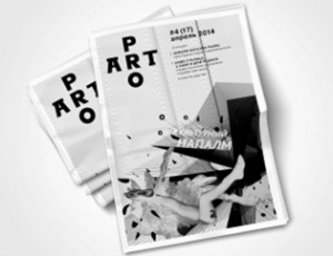 ProArt
ProArt editorail design -
 Catalog of IX International Eco-poster Triennial "the 4th Block"
Каталог ІХ Міжнародної Триєнале Еко-плакату «4-й Блок» book design -
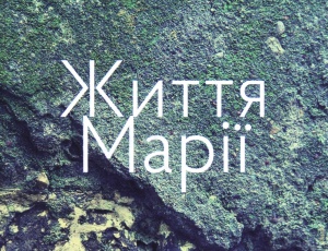 Life of Mariya
Життя Марії book design -
 Staging the Ukrainian Avant-garde of the 1910s and 1920s
Інсценізація українського авангарду 1910-1920 років book design -
 Dia/Log*
Дія/Лог poster -
 Poster FAQ
Poster FAQ poster -
-tmb.jpg) "Utopia 8" Intelligent Store
"Utopia 8" Intelligent Store
Інтелектуальна Крамниця «Утопія 8» corporate branding -
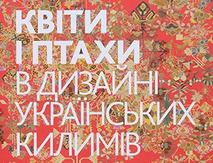 Flowers and Birds in Ukrainian Kilim Design
Квіти і птахи в дизані українських килимів book design -
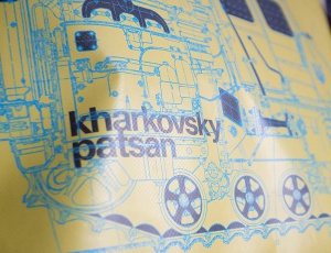 GRAFPROM's bags
Сумки от GRAFPROM bags and stuff -
 Luk
Luk
Lюk cd cover -
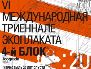 VI International Eco-Poster Triennial "the 4th Block"
VI Международная Триеннале Эко-плаката «4-й Блок» exhibition identity -
 VII International Eco-Poster Triennial "the 4th Block"
VII Международная Триеннале Эко-плаката «4-й Блок» exhibition identity -
 Boris Kosarev
Борис Косарев book design -
 Cossac Mamai
Козак Мамай book design -
 Presentation of Mamai book
Презентаці книги «Козак Мамай» promo