
JOHN'S HOTEL
JOHN'S HOTEL
brand identity
Визуальный язык John's Hotel построен на важности семейного наследия и семейных ценностей.
Логотип John's Hotel основан на сочетании трех типографских традиций — с засечками, без засечек и каллиграфии. Таким образом мы визуально передаем наследие, современный подход и добавляем индивидуальности.
Знак John's представляет собой смесь нескольких символов, которые черпают вдохновение в философии бренда. Здесь вы можете увидеть букву J - начальную букву названия бренда, стилизованную под цветок, прорастающий сквозь поверхность земли. Очень важно отметить, что мы изображаем цветок с его корнем, потому что корни являются ядром ценностей бренда.
The visual language of John's Hotel is built on the importance of family heritage and family values.
John's Hotel logo is based on a mixture of 3 typographic traditions - Serif, Sans Serif and Calligraphic. Thus we visually convey heritage, modern approach and add a personal touch.
John's logomark is a blend of several symbolls which draw inspiration in the brand's philosophy. You can see here a J letter - the initial letter for the brand's title, stylized as a flower which is growing through the surface of the ground. Very important to note that we depict the flower with it's root because roots are the core of the brand's values.


.jpg)
other works / другие работы
-
 Im Zeitraffer. Kunsthaus Graz
У часовому проміжку. Кунстхаус Грац spatial, mural, poster, infographics -
 XX Kunsthaus Graz
XX Кунстхаус Грац visual identity, poster -
 Minus minus plus plus
- - / + + visual identity, digital campaign, poster -
 Blueprint for a Museum. Kunsthaus Graz
План музею, Кунстхаус Грац book design, layout -
 volkadot. Educational design
volkadot. Освітній дизайн brand identity -
 ELECTRON CAFE
ELECTRON. Кафе brand identity -
 KAI FENG. Direct tea trade merchants
KAI FENG. Чайна компанія brand identity -
 FUNATTIC. Climbing center
FUNATTIC. Скелелазний центр brand identity -
 SNIG NA GOLOVU. Restaurant
СНІГ НА ГОЛОВУ. Ресторан brand identity -
 FAHRWEST LOGISTICS
FAHRWEST. Логістична компанія brand identity -
 EASTMAN. Restaurant
ІСТМЕН. Ресторан brand identity -
 lardi. Cargo transportation
lardi. Вантажні перевезення brand identity -
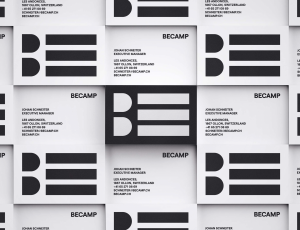 BECAMP. Coworking space
BECAMP. Коворкінг нового покоління brand identity -
 GOGOL
GOGOL
GOGOL brand identity -
 Meddins
Meddins -
 Nasha Dacha
Наша Дача -
 THEURA. SOFIA YABLONSKA
ТЕУРА. СОФІЯ ЯБЛОНСЬКА -
 TURTLE. Antisocial network
Антисоціальна мережа TURTLE brand identity -
 PRIDE BIKES
Український велобренд brand identity -
 LOCUS DESIGN GROUP
Группа компаний Локус Дизайн brand identity -
 Sandhaana Yoga
Сандхаана Йога brand identity -
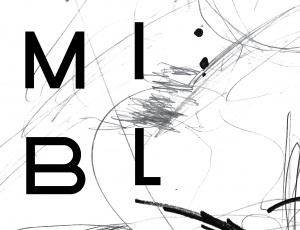 MISHI BLYAHERA. Restaurant
Мыши Бляхера. Ресторан brand identity -
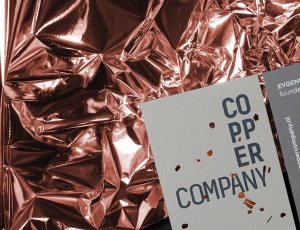 Copper Company. Architecture bureau
Архитектурное бюро. Copper Company -
 Italian Edition & Italian Edition №2
Итальянская Редакция & Итальянская Редакция №2 -
 Grata Eco House Suisse
Швейцарский офис Грата Еко Хаус identity, visual identity, logo, catalogue design -
 ZUZU. Restaurant
ЗУЗУ. Ресторан brand identity -
 Car Castle. Swiss luxury car storage
Car Castle. Гаражный комплекс класса люкс brand identity -
 ZhZL
ZhZL
ЖЗЛ brand identity -
 +object. Design and production
Дизайн и продакшен компания +object brand identity, naming -
 Kazimir Malevich. Kyiv period. 1928-1930
Казимир Малевич. Київський період 1928-1930 book design -
 Café Très
Café Très brand identity, naming -
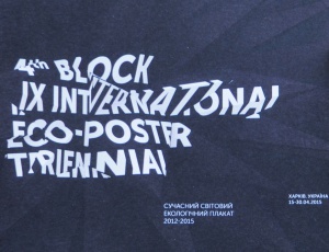
-tmb.jpg) International Eco-poster Triennial “the 4th Block”
International Eco-poster Triennial “the 4th Block”
IX Міжнародна Триєнале Еко-плакату "4-й Блок" visual identity -
-tmb.jpg) Lit Museum identity
Lit Museum identity
Ідентифікація Літ Музею brand identity -
 Linia art / UA avant-garde
Лінія art / український авангард promo -
 Linia art / UA kilim design
Лінія art / українські килими promo -
 Ukrainian prints
Українські принти promo -
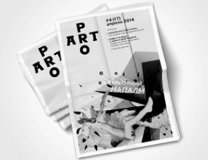 ProArt
ProArt editorail design -
 Catalog of IX International Eco-poster Triennial "the 4th Block"
Каталог ІХ Міжнародної Триєнале Еко-плакату «4-й Блок» book design -
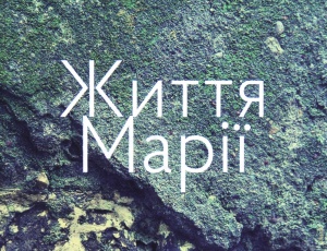 Life of Mariya
Життя Марії book design -
 Staging the Ukrainian Avant-garde of the 1910s and 1920s
Інсценізація українського авангарду 1910-1920 років book design -
 Dia/Log*
Дія/Лог poster -
 Poster FAQ
Poster FAQ poster -
-tmb.jpg) "Utopia 8" Intelligent Store
"Utopia 8" Intelligent Store
Інтелектуальна Крамниця «Утопія 8» corporate branding -
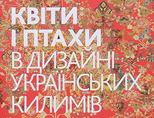 Flowers and Birds in Ukrainian Kilim Design
Квіти і птахи в дизані українських килимів book design -
 GRAFPROM's bags
Сумки от GRAFPROM bags and stuff -
 Luk
Luk
Lюk cd cover -
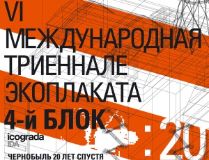 VI International Eco-Poster Triennial "the 4th Block"
VI Международная Триеннале Эко-плаката «4-й Блок» exhibition identity -
 VII International Eco-Poster Triennial "the 4th Block"
VII Международная Триеннале Эко-плаката «4-й Блок» exhibition identity -
 Boris Kosarev
Борис Косарев book design -
 Cossac Mamai
Козак Мамай book design -
 Presentation of Mamai book
Презентаці книги «Козак Мамай» promo