
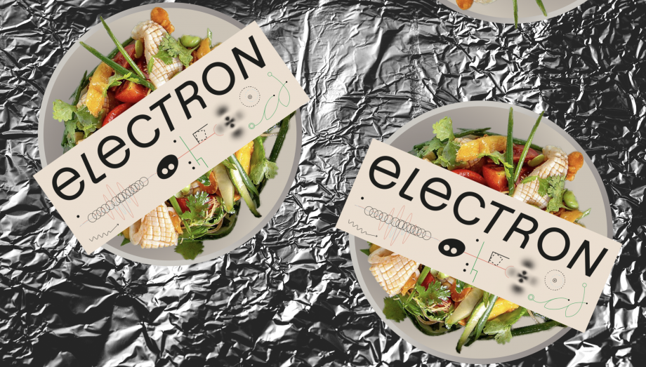
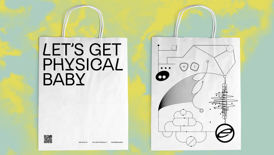
ELECTRON CAFE
ELECTRON. Кафе
brand identity
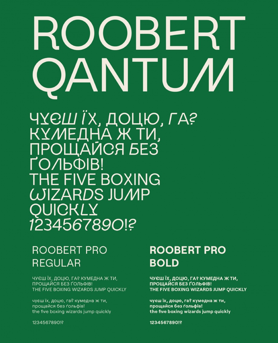
Шрифтовa частина логотипу поєднує в собі великі та малі літери, пряме й курсивне накреслення — подібно до того, як електрон поєднує властивості і хвилі, і частинки водночас. Це надає логотипу енергійності та зарядженості.
Знак electron — це ніщо інше, як елементарна частинка, оточена власною орбітою. Електрон ніколи не стоїть на місці й не втрачає заряд — саме цим зумовлена динамічність знака, який прагне стати тривимірним.
Ми використовуємо Roobert Quantum — акцидентний «гік»-шрифт для заголовків. У ньому пластика символів, що застосовуються у фізиці, надає строгому гротеску науковості, а водночас — жвавості та рухливості.
The font part of logo combines uppercase and lowercase, direct and oblique lettering, therefore, as an electron combines properties and waves, and particles combine - this is the logo of energy, charge.
The sign of an electron is nothing but an elementary particle surrounding its orbit. The electron never stands still, and does not require a charge - due to the dynamism of the sign, which includes three-dimensional.
We use Roobert Quantum, a geeky display font for headings. As far as the printing of symbols is concerned, physics reports a strict grotesque science and, at the same time, liveliness, mobility.


other works / другие работы
-
 Im Zeitraffer. Kunsthaus Graz
У часовому проміжку. Кунстхаус Грац spatial, mural, poster, infographics -
 XX Kunsthaus Graz
XX Кунстхаус Грац visual identity, poster -
 Minus minus plus plus
- - / + + visual identity, digital campaign, poster -
 Blueprint for a Museum. Kunsthaus Graz
План музею, Кунстхаус Грац book design, layout -
 JOHN'S HOTEL
JOHN'S HOTEL brand identity -
 volkadot. Educational design
volkadot. Освітній дизайн brand identity -
 KAI FENG. Direct tea trade merchants
KAI FENG. Чайна компанія brand identity -
 FUNATTIC. Climbing center
FUNATTIC. Скелелазний центр brand identity -
 SNIG NA GOLOVU. Restaurant
СНІГ НА ГОЛОВУ. Ресторан brand identity -
 FAHRWEST LOGISTICS
FAHRWEST. Логістична компанія brand identity -
 EASTMAN. Restaurant
ІСТМЕН. Ресторан brand identity -
 lardi. Cargo transportation
lardi. Вантажні перевезення brand identity -
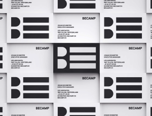 BECAMP. Coworking space
BECAMP. Коворкінг нового покоління brand identity -
 GOGOL
GOGOL
GOGOL brand identity -
 Meddins
Meddins -
 Nasha Dacha
Наша Дача -
 THEURA. SOFIA YABLONSKA
ТЕУРА. СОФІЯ ЯБЛОНСЬКА -
 TURTLE. Antisocial network
Антисоціальна мережа TURTLE brand identity -
 PRIDE BIKES
Український велобренд brand identity -
 LOCUS DESIGN GROUP
Группа компаний Локус Дизайн brand identity -
 Sandhaana Yoga
Сандхаана Йога brand identity -
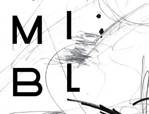 MISHI BLYAHERA. Restaurant
Мыши Бляхера. Ресторан brand identity -
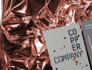 Copper Company. Architecture bureau
Архитектурное бюро. Copper Company -
 Italian Edition & Italian Edition №2
Итальянская Редакция & Итальянская Редакция №2 -
 Grata Eco House Suisse
Швейцарский офис Грата Еко Хаус identity, visual identity, logo, catalogue design -
 ZUZU. Restaurant
ЗУЗУ. Ресторан brand identity -
 Car Castle. Swiss luxury car storage
Car Castle. Гаражный комплекс класса люкс brand identity -
 ZhZL
ZhZL
ЖЗЛ brand identity -
 +object. Design and production
Дизайн и продакшен компания +object brand identity, naming -
 Kazimir Malevich. Kyiv period. 1928-1930
Казимир Малевич. Київський період 1928-1930 book design -
 Café Très
Café Très brand identity, naming -
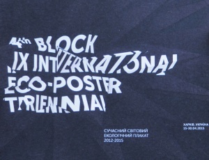
-tmb.jpg) International Eco-poster Triennial “the 4th Block”
International Eco-poster Triennial “the 4th Block”
IX Міжнародна Триєнале Еко-плакату "4-й Блок" visual identity -
-tmb.jpg) Lit Museum identity
Lit Museum identity
Ідентифікація Літ Музею brand identity -
 Linia art / UA avant-garde
Лінія art / український авангард promo -
 Linia art / UA kilim design
Лінія art / українські килими promo -
 Ukrainian prints
Українські принти promo -
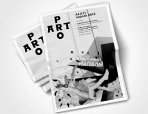 ProArt
ProArt editorail design -
 Catalog of IX International Eco-poster Triennial "the 4th Block"
Каталог ІХ Міжнародної Триєнале Еко-плакату «4-й Блок» book design -
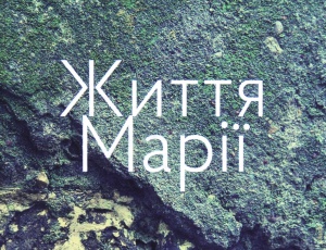 Life of Mariya
Життя Марії book design -
 Staging the Ukrainian Avant-garde of the 1910s and 1920s
Інсценізація українського авангарду 1910-1920 років book design -
 Dia/Log*
Дія/Лог poster -
 Poster FAQ
Poster FAQ poster -
-tmb.jpg) "Utopia 8" Intelligent Store
"Utopia 8" Intelligent Store
Інтелектуальна Крамниця «Утопія 8» corporate branding -
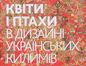 Flowers and Birds in Ukrainian Kilim Design
Квіти і птахи в дизані українських килимів book design -
 GRAFPROM's bags
Сумки от GRAFPROM bags and stuff -
 Luk
Luk
Lюk cd cover -
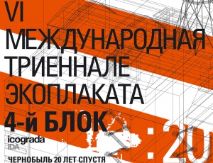 VI International Eco-Poster Triennial "the 4th Block"
VI Международная Триеннале Эко-плаката «4-й Блок» exhibition identity -
 VII International Eco-Poster Triennial "the 4th Block"
VII Международная Триеннале Эко-плаката «4-й Блок» exhibition identity -
 Boris Kosarev
Борис Косарев book design -
 Cossac Mamai
Козак Мамай book design -
 Presentation of Mamai book
Презентаці книги «Козак Мамай» promo