
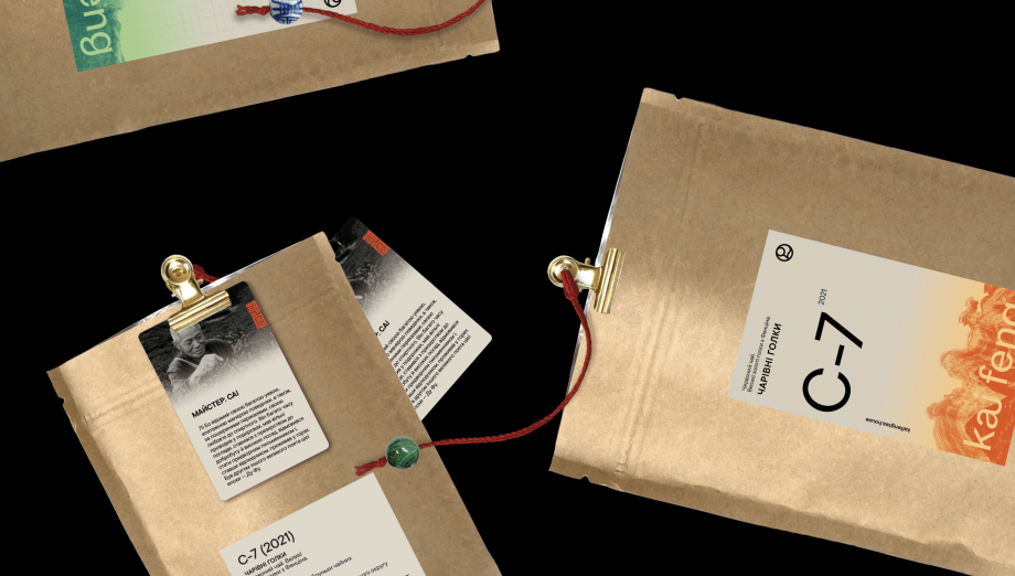
KAI FENG. Direct tea trade merchants
KAI FENG. Чайна компанія
brand identity
Логотип KAI FENG поєднує в собі лаконічність та вишуканість. Він побудований на основі сучасної шрифтової інтерпретації неоґротесків — легендарних шрифтів епохи модернізму, що подарувала світові досконалу позачасову шрифтову форму.
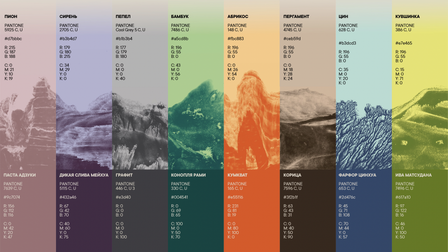
Основою знака KAI FENG став алхімічний символ квінтесенції (лат. quinta essentia, «п’ята сутність»). Синонімами цього поняття є «п’ята стихія», «п’ятий елемент», а також «ефір».
Первісно у давньогрецькій міфології термін «ефір» означав верхній (гірній), особливо тонкий, прозорий і сяйливий шар повітря, яким дихають боги. Саме там і зростає чай.
Велич і краса природи відіграють важливу роль в образі нашого бренду.
Цю силу стихії у візуальному стилі KAI FENG передають ілюстрації, виконані у техніці монотипії за допомогою китайської туші. Споглядання цих картин налаштовує на особливий медитативний лад і наповнює душу поезією.
The KAI FENG logo combines conciseness and sophistication. It is built on the basis of a modern set of neo-grotesque typefaces - the legendary typefaces of the modernist era, which gave the world a perfect timeless type form.
The basis of the KAI FENG sign is alchemical symbol of quintessence (lat. quinta essentia, “fifth essence”). Synonyms for this concept are “fifth element”, and also “ether”.
Initially, in ancient Greek mythology, the term "ether" meant the upper (mountainous), especially thin (rarefied), transparent and radiant layer of air that the gods breathe. Here where tea grows.
The splendor and beauty of nature plays a big role in the image of our brand.
This force of the elements in the style of KAI FENG is conveyed by illustrations,
made in the monotype technique using Chinese ink. Contemplation of this picture tunes in a special meditative mood and fills the soul with poetry.


other works / другие работы
-
 Im Zeitraffer. Kunsthaus Graz
У часовому проміжку. Кунстхаус Грац spatial, mural, poster, infographics -
 XX Kunsthaus Graz
XX Кунстхаус Грац visual identity, poster -
 Minus minus plus plus
- - / + + visual identity, digital campaign, poster -
 Blueprint for a Museum. Kunsthaus Graz
План музею, Кунстхаус Грац book design, layout -
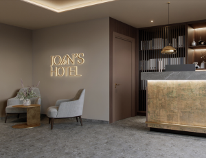 JOHN'S HOTEL
JOHN'S HOTEL brand identity -
 volkadot. Educational design
volkadot. Освітній дизайн brand identity -
 ELECTRON CAFE
ELECTRON. Кафе brand identity -
 FUNATTIC. Climbing center
FUNATTIC. Скелелазний центр brand identity -
 SNIG NA GOLOVU. Restaurant
СНІГ НА ГОЛОВУ. Ресторан brand identity -
 FAHRWEST LOGISTICS
FAHRWEST. Логістична компанія brand identity -
 EASTMAN. Restaurant
ІСТМЕН. Ресторан brand identity -
 lardi. Cargo transportation
lardi. Вантажні перевезення brand identity -
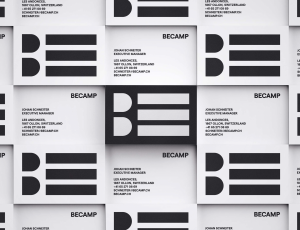 BECAMP. Coworking space
BECAMP. Коворкінг нового покоління brand identity -
 GOGOL
GOGOL
GOGOL brand identity -
 Meddins
Meddins -
 Nasha Dacha
Наша Дача -
 THEURA. SOFIA YABLONSKA
ТЕУРА. СОФІЯ ЯБЛОНСЬКА -
 TURTLE. Antisocial network
Антисоціальна мережа TURTLE brand identity -
 PRIDE BIKES
Український велобренд brand identity -
 LOCUS DESIGN GROUP
Группа компаний Локус Дизайн brand identity -
 Sandhaana Yoga
Сандхаана Йога brand identity -
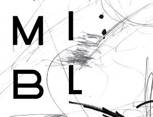 MISHI BLYAHERA. Restaurant
Мыши Бляхера. Ресторан brand identity -
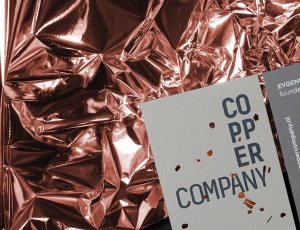 Copper Company. Architecture bureau
Архитектурное бюро. Copper Company -
 Italian Edition & Italian Edition №2
Итальянская Редакция & Итальянская Редакция №2 -
 Grata Eco House Suisse
Швейцарский офис Грата Еко Хаус identity, visual identity, logo, catalogue design -
 ZUZU. Restaurant
ЗУЗУ. Ресторан brand identity -
 Car Castle. Swiss luxury car storage
Car Castle. Гаражный комплекс класса люкс brand identity -
 ZhZL
ZhZL
ЖЗЛ brand identity -
 +object. Design and production
Дизайн и продакшен компания +object brand identity, naming -
 Kazimir Malevich. Kyiv period. 1928-1930
Казимир Малевич. Київський період 1928-1930 book design -
 Café Très
Café Très brand identity, naming -
-tmb.jpg) International Eco-poster Triennial “the 4th Block”
International Eco-poster Triennial “the 4th Block”
IX Міжнародна Триєнале Еко-плакату "4-й Блок" visual identity -
-tmb.jpg) Lit Museum identity
Lit Museum identity
Ідентифікація Літ Музею brand identity -
 Linia art / UA avant-garde
Лінія art / український авангард promo -
 Linia art / UA kilim design
Лінія art / українські килими promo -
 Ukrainian prints
Українські принти promo -
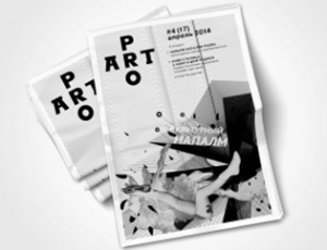 ProArt
ProArt editorail design -
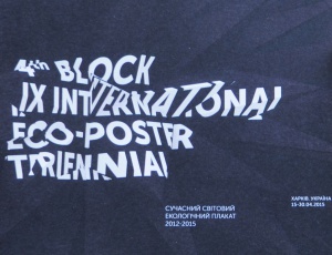 Catalog of IX International Eco-poster Triennial "the 4th Block"
Каталог ІХ Міжнародної Триєнале Еко-плакату «4-й Блок» book design -
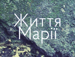 Life of Mariya
Життя Марії book design -
 Staging the Ukrainian Avant-garde of the 1910s and 1920s
Інсценізація українського авангарду 1910-1920 років book design -
 Dia/Log*
Дія/Лог poster -
 Poster FAQ
Poster FAQ poster -
-tmb.jpg) "Utopia 8" Intelligent Store
"Utopia 8" Intelligent Store
Інтелектуальна Крамниця «Утопія 8» corporate branding -
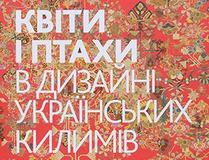 Flowers and Birds in Ukrainian Kilim Design
Квіти і птахи в дизані українських килимів book design -
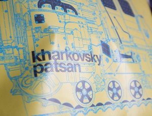 GRAFPROM's bags
Сумки от GRAFPROM bags and stuff -
 Luk
Luk
Lюk cd cover -
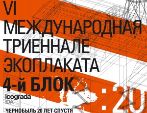 VI International Eco-Poster Triennial "the 4th Block"
VI Международная Триеннале Эко-плаката «4-й Блок» exhibition identity -
 VII International Eco-Poster Triennial "the 4th Block"
VII Международная Триеннале Эко-плаката «4-й Блок» exhibition identity -
 Boris Kosarev
Борис Косарев book design -
 Cossac Mamai
Козак Мамай book design -
 Presentation of Mamai book
Презентаці книги «Козак Мамай» promo